It’s that time again when a new kit emerges and every Nottingham Forest fan reminds us of their favourite Forest shirt over the years.
And every fan has their favourite Forest shirt. Whether for reasons of nostalgia – a time, a place, a player or a game – or just an eye for detail and aesthetics, every one of us can name two of three Forest kits that we affectionally call our favourite Forest shirt.
All about the Brand
It’s all about the brand. There are only a limited number of brands involved in iconic kits but, for sheer quality and design, for me, it’s got to be adidas.
I don’t particularly like the Umbro and Nike designs, especially the dull England kits that both companies have churned out over the years, but despite not working with Forest, I still have fond memories of Admiral kits.
There’s something about Admiral. Although I recall Norwich City, Spurs, Crystal Palace, Dirty Leeds, and Coventry City designs from the seventies, it’s their flagship England shirt with the red and blue panels of the early eighties that really shines for me – https://admiralsports.com/pages/history.
In fact, the design from the 1982 World Cup in Spain is so popular that its appeal continues and is still quite apparent at this year’s Euros, over forty years later.
England fans, pundits and reporters were wearing the design all over Germany for the best part of a month, as England progressed to another crushing defeat in the final.
Although adidas has continually changed its logo since 1991 – https://www.footyheadlines.com/2018/12/90-years-old-next-year-full-adidas-logo-history.html – there is something quite special about a football shirt with the adidas ‘leaf’ logo.
Favourite Forest shirts and adidas
Regardless of the team, the 1971 logo which is now synonymous with cannabis production just conjures nostalgic times for me.
When the adidas leaf was ever-present on football kits, the weather was better, food was cheaper, capitalism was working; Spain and Greece liked tourists, Coca-Cola tasted sweeter, Brazil were fun to watch, Maradona was young, you could get a doctor, and Forest were winning significant European trophies.
Even Brian Clough looked cool on the touchline, emblazed in his three-striped adidas tracksuit.
Big Business
Football kits are big business these days although most football clubs are lucky to see more than a 10% return from the revenue of shirts sales.
As lucrative as it may seem when selling at least three different shirts in one season, clubs like Forest will only see relatively small change from a £75.00 shirt.
A club would have to sell one million shirts and take about 20% from the sales to be able to buy a half-decent player with the profits – https://www.goal.com/en-gb/news/how-much-money-do-football-clubs-make-from-shirt-sales/gv14e9wc0vny1vtyr0rxqqan5.
You need to sell shirts on the Asian market like Manchester United to be able to make a real return from a kit design. Only then can a club afford to waste money on a player like fake Brazilian Antony – “What-a-waste-of-moneeeey!”
In fact, when adidas signed their £75million-a-year deal with VAR-chester United, they said they expected to recoup £1.5bn by the end of this year.
The Third Kit
In the days when football was better, most clubs managed to play an entire season, home, away and abroad with just two kits. Forest’s yellow and blue kits from the ’70s/80s – my all-time favourite Forest shirt – were perfect for avoiding the possibility of a colour clash, unless Forest played Lecce away in Italy.
I was under the impression that the third kit was started by a club like Spurs or Man Utd in the late 80s, as a way to initiate extra revenue, but I noticed that England wore a third kit in 1970! – https://kitgeek.wordpress.com/2018/06/11/england-and-some-sky-blue-thinking/ .
As we have experienced with Forest kits – particularly the shirt that looked as if it had been manufactured from the covers of a luxury Trent-Barton coach – there are no colour or design restrictions.
A club can adopt anything from plain monochromatic designs to the bright pinks and yellows from Stabilo Boss highlighter selections. You can design shirts with multiple colours, shadow stripes, a Jackson Pollock splatter; with collars that lose their shape after a dozen washes, a V-neck, or even shoulder pads – https://www.dailymail.co.uk/sport/football/article-8996763/Third-kits-Premier-League-wrong-making-money.html.
There is no denying it and clubs don’t hide the marketing fact either: the third kit is largely unnecessary and is just a money-making scam.
All a club has to do is reverse the home colours for the away kit and, hey presto, a third kit immediately becomes necessary.
Favourite Forest kit designs.
From Adidas, Umbro and Macron, there have been winners and losers along the way, all producing memorable designs on the back of memorable players.
The days have gone when clubs wore the same kit for more than one season. Those of a certain age will remember that the shirt Robertson wore when he scored in Madrid was the identical design from the previous season when John McGovern lifted the first of two European Cups.
I recall Ian Wallace scoring a hattrick in the pinstriped adidas shirt a couple of seasons later; Stan Collymore wearing a heavy, long-sleeved blue and green Umbro shirt in the rain as he charged through the midfield and opened up defences; the bright yellow and orange shirt wore in the promotion play-off season, and the crazy yellow/red/black Labatt’s shirt of the mid-nineties.
Regardless of the occasion or the season, we all have our personal, favourite Forest shirt.
Personal Favourite Forest shirt.
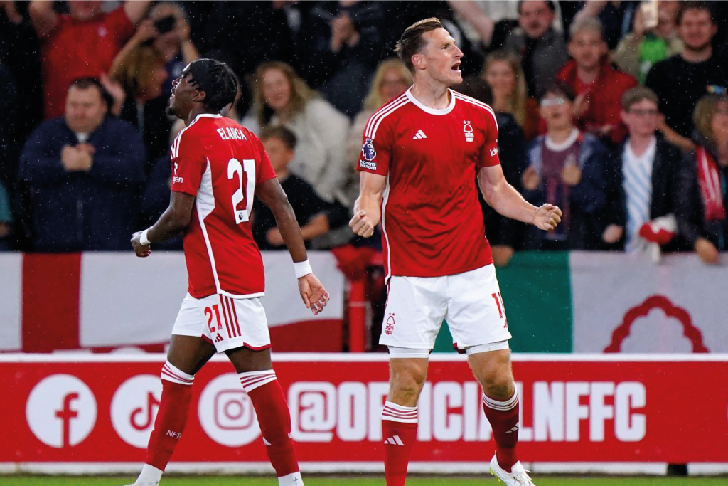
It’s as if we have gone full circle with this year’s home kit. It’s adidas and relatively plain like the classic 1978 kit but with an emphasis on the two stars.
I’ll be honest, I find the new design quite boring and I struggle to see those stars in the shadows of the fabric. I feel as if adidas has spent more time on the design of the Arsenal and Leeds shirt than ours, leaving us with an afterthought.
There is all this talk of the fabric being nicer, with clean lines and an authentic feel, but it’s just disappointing when you see more creativity in the Belgian adidas kit than in the Forest shirt.
It doesn’t even have the white lines down the sides like the Spain or Leeds kit by the same manufacturer. I’m not even sure about that line on the shorts either, and the socks – don’t get me started on the socks – are just dull. There isn’t even any trim on the socks.
I thought adidas did a good job with last year’s kit – nice designs and some good colour combinations – but, unless the third kit is anything to shout about, I don’t think they are gonna sell many in Senegal and Kuala Lumpur.
We have seen iconic adidas kits, the crazy Labatt’s away kit, the flamboyant but equally fluorescent Macron kit from the promotion years, and the plain but itchy Umbro shirts that accompanied us in the lower tiers, but I think it was now time for adidas to do something quite different for Forest.
Adidas have even made retro tracksuits with the old logo in the past. Where is our retro version? – https://www.adidas.co.uk/football-jerseys
If adidas could have revived an old spirit within the shirt and encapsulated the true essence of the club with an iconic new design, they could potentially improve Forest’s revenue from sales outside of the city.
What is your favourite Forest shirt? Are you happy with the new adidas designs for the 2024-25 season?


